Just because we humans can eat most things doesn’t mean we humans should eat most things — at least, not all the time. In the days of yore a balanced diet could be fairly assured with any national cuisine (traditional foods having earned their regular place at the table because those who ate them thrived), but once people moved away from home and had to cook for themselves, often using unfamiliar ingredients, things began to go awry. (Think what happens to a teenager suddenly released from the tyranny of the family dinner who lives on nothing but beer and pizza his or her first year of college.) Once the science behind why certain foods were beneficial, and in what proportion they were best consumed was uncovered, it behooved governments to educate their citizens on basic nutrition in order to ensure a healthy populace.
In 1941 saw the publication of America’s first nutrition guides, which determined the following daily allowances:
one pint of milk for adults
one quart of milk for children
one generous serving of meat, fish, or poultry daily with a serving of liver once a week
two eggs or
one egg and an extra serving of meat or
one egg and at least one ounce of cheese
two servings of vegetables, one should be leafy
one serving of white or sweet potatoes, eating the skin too
two servings of fruit, one should be citrus
dark whole grain in bread and breakfast cereal
at least three servings of butter on bread and vegetables
six to eight glasses of water
Note that the guide is written in the form of a list, with proteins, fats and carbohydrates in order. All are whole foods. It is a general list, allowing for a great deal of flexibility to account for traditional foods. Note what isn’t on there, too: no sweets or refined sugars of any kind.
By 1943, in the midst of war, this advice was made into a colorful pie chart which grouped foods and presented them equally, each slice the same size, much as one would have divided a real pie. In the middle we have a sturdy looking family walking towards us with the rejoinder that the “US needs us strong.”
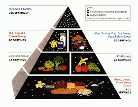
By 1992 the US Department of Agriculture decided that the pie chart’s misleading visual recommendation that each food group was of equal value, and that one could select from it like a buffet bar needed updating, and so presented us with the food pyramid, which was designed to show not only which foods we should be eating, but how much of them. It is a solid pyramid, like those at Giza. At its base are loaves of bread. In the middle, a bunch of fruits and vegetables. Nearer the top are the animal products, meat, fish, eggs, dairy. And on top, like a crowning prize (and what we see on a dollar bill), a smaller pyramid with white sprinkles representing goodies. Clearly this new diagram meant to foreground carbohydrates as the foundation for eating, a point of view that echoed the era's thinking on the dangers of fat. But this is not how most Americans actually eat. In fact, we eat the reverse, with those white sprinkles littered throughout.
Fortunately, this has not lasted long. In 2011 the USDA reverted to the plate as its central theme — literally. It’s done away with pictures of food altogether in favor of Trivial Pursuit-like wedges and a glass of milk. It assumes we know what foods constitute proteins (are they separate from grains, though?) and obviously seeks to show how much of our own plates these foods should occupy. The trouble is that not many people actually eat off plates any more. The people for whom this graphic is designed eat out of wrappers and packets and through straws. Though a plastic fork has been provided, people mostly use their fingers. There is no space for sweets, so how much should one eat of those? And where is the soda? Does the dairy in a circle represent a milkshake? By casting the food groups as spatial territories, the USDA is essentially drawing a map to guide our nutrition choices, but not one grounded in any easily applied logic. How does one judge the correct proportion of dairy (a circle) to fruits (a triangle)? How much dairy is an apple equal to, exactly?
Perhaps it’s time we reverted back to the original advice we were given in 1941, where everything was quite actually spelled out. Liver. Once a week. For all.
America’s Nutrition Primer: What To Eat And Why, Eleanora Sense, 1941


