>
Showing posts with label Cucumber. Show all posts

Tuesday, November 22, 2011

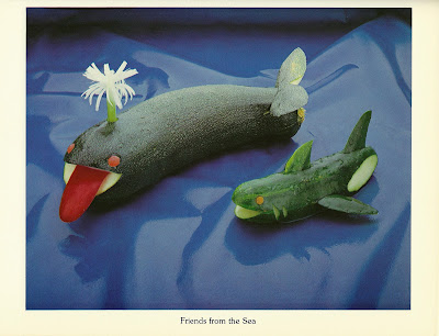
Sea Cucumber


Shark: Oi! You!

Whale: Wassup!

Shark: What in Neptune’s Depths are you?

Whale: I am a zucchini.

Shark: What species is that?

Whale: Curcubita Pepo.

Shark: Never heard of it. What are you related to?

Whale: Well, all squashes, really — cucumbers, marrows, acorn squash, spaghetti squash, that sort of thing.

Shark: You’re not a Sea Cucumber, then?

Whale: Oh, no — they’re animals, not plants. Completely different Kingdom altogether. You look a bit odd yourself. What are you?

Shark: A pickle. Cucumis Sativus to be precise.

Whale: Then we’re cousins!

Shark: What?

Whale: Sure: we’re both part of the Cucurbitoideae family.

Shark: No way!

Whale: You better believe it. You’re a gourd. You look a bit like a gourd. Except with fins.

Shark: What happened to your fins? How do you swim?

Whale: With great difficulty. Someone forgot to make me any.

Shark: Tough rap, Cuz.

Whale: Tell me about it. Hey — nice running in to you. Maybe I’ll catch you again sometime.

Shark: If no-one catches you first!

How To Garnish, International Culinary Consultants, 1983

Also from this book: Salad Worms And Melon Whales
Friday, August 19, 2011

Beet-Pineapple Mold and Other Perfect Salads


 In his foundational text on the subject, The Elements of Typographic Style, Robert Bringhurst notes that “typography exists to honor content.” He goes on to say: “when type is poorly chosen, what the words say linguistically and what the letters imply visually are disharmonious, dishonest, out of tune.”

As far as page layouts go, this one isn’t bad. There is proportion, balance, an easy line for the eye to follow. The recipe titles are clear; there is enough white space to lend a certain grace and clarity to the page. The typographer has utilized italics, all-caps, tab spaces and hyphens with a practiced and subtle eye. The page as a whole exhibits classic depths of margin and gutter. Clearly, a professional is at work and we should rightly take a moment to applaud what usually goes — by design — unnoticed. It is typographic poetry.

It’s a damn shame the actual words constitute such shit.

Salad Book, Better Homes and Gardens, 1969
Pin It